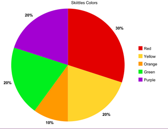
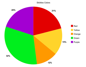
Today in math my class all got 10 skittles each and we got the percents for each color, red, green, yellow, orange, and purple. We all did our own individual samples and then we did a class sample. We were trying to find out what percent is each color of the bag of Skittles. Then we made two pie charts to represent the data We put together class data because the more you have the numbers will be more accurate.The pie chart on the left is my data and the one on the right is the class data.
| | |
 RSS Feed